Andrew Eugene

A UX designer based in Sri Lanka, Andrew Eugene has steadily grown a loyal online following for his boldly creative animations and interaction designs.
I had the pleasure of interviewing Andrew for this June’s “Motion” issue to hear more about his thoughts on interaction design and his approach to designing products with motion. He offers fantastic suggestions for how to think about motion, his inspirations, and support for anyone interested in getting started in motion design.
A Chat with Andrew Eugene 💬
1. You've described yourself as an interaction designer. But in your designs, you're often mixing photos, videos, and even sound. How would you describe the role of an interaction designer compared to a UX or UI designer or even a sound designer? Do you consider them separate?
Answer: At work, I'm a UX designer, but on social media, I try to focus more on interaction design and the motion part of UX.
They are very much separate roles, but what all of these roles share is their main objective: to define a delightful experience for the user. An ideal interface requires minimal interaction cost, or the effort required to operate an interface. A UX designer tries to keep this interaction cost as low as possible, while an interaction designer tries to make that remaining interaction cost as delightful and meaningful as possible. It’s about keeping the user engaged with the interface, while still clearly expressing what's going on.
“A UX designer tries to keep the interaction cost as low as possible, while an interaction designer tries to make that remaining interaction cost as delightful and meaningful as possible.
”
2. Many of your designs use bold and fluid animations, while your more recent designs use subtler motions, like gradual shifts in light or a slow pan left to right. Could you tell me more about your process for developing that personal aesthetic? 🎨
Answer: The reason for transitioning to more subtle animation has to do with material design and human interface guidelines. They recommend keeping the animations tight and as short as possible in order to make it delightful. But by speeding up animations to keep it tight, we don't get to experience the flow or the smoothness, so I intentionally keep it a bit slow, so the viewer can experience what's going on behind the scenes.
Most of the earlier animations on my profile are built in AfterEffects, so I had to manually tune everything to look like an interaction with a human touch. For the later animations, I used Principle, Protopie or any other modern interaction design tool, so those built-in responses to the triggers were actually more consistent. The tools provide about 30 centiseconds of a transition period by default. I actually try to extend it to 50 centiseconds, which makes transitions a bit smoother and give viewers enough time to experience the transition.

⤷ Andrew’s Movie Library Concept | Click the link for full sound!
3. That makes sense. When you're working on different projects, how do you decide when you want to use quicker animations versus something that's a slower experience? 🐆🐢
Answer: It depends on the application. Apple and Google design guidelines suggest that the tighter animations, the better. Usually, I stick to short animations because the entire objective of an application might be to provide a quick, to-the-point transition to the user.
For example, in a banking app, if a user wants to make a transaction, you wouldn't want to give the user a slow, enjoyable animation. But if I'm designing an app for kids, I might move things around a little bit slower and engage with them more than I would for the banking app.

⤷ Andrew’s 404 Page Concept, featuring a subtle, floating animation style.
4. Your designs feel really cohesive, even when you're using different types of animations. How do you think about creating animations as a system?
Answer: There’s a designer, Issara Willenskomer, who introduced a guideline of 12 motions, which includes all the types of responses that a touch can trigger. I continuously follow this defined system when I design any interaction. I also make sure that all animations are set on a fixed timescale, so that whatever animation we decide to use, the results will always be delivered at the same time. This helps keep things cohesive and consistent.

⤷ Issara Willenskomer’s 12 Principles of UX in Motion
5. Where do you go to find inspiration? 💡
Answer: There is a collective source of inspiration. Dribbble would be my first place to browse. Dribbble tends to weigh more on concepts, not real world application. I use Behance for more real world projects. Within good projects, I try to find examples of interaction being used. For live app examples, I use mobile-patterns. They record and upload real-world applications, so that people like you and me can go and look. For example, if you wanted to look at the refresh interaction of Snapchat, you can go there, instead of downloading the application and going through it all over again.

⤷ Andrew’s Dribbble account | Follow him for your own inspiration!
6. Are there any specific designers that you follow or that you admire? 😇
Answer: I was first inspired by a person called Daniel (Instagram, Dribble). He designed a shoe customization interaction with a menu that had a rainbow blast appear from the right. It was really inspiring and about two years ago, I wanted to try it out. That was the starting point of everything. Other than that, there are lots of other interaction designers that are popping up. For example, Gleb, who works on flight-based animations, inspires me a lot. There's another guy called Pham. Those guys are actually my inspiration to begin this in the first place and I look up to them almost every day.

⤷ Add to Cart Interaction, by Dannniel | The very first interaction that inspired Andrew.
7. What do you do when a client asks you, "Why does animation or why does motion matter?" What do you say?
I actually insist on always including microinteractions when building an application. I wouldn’t put too much pressure on using motion since most frameworks already include transitional animation by default. Microinteractions further enhance the application by providing instant feedback. For example, when you tap on a heart and it doesn't just appear red, it explodes into hearts and delights the user.
The thing about motion is that though it looks delightful on a prototype, it's taxing for performance on mobile phones and not everyone has the best mobile phones out there. Micro interactions, on the other hand, can be used with plugins like Lottie, so it's much easier now to implement it. In a real world scenario, microinteractions enhance the experience with less tax on performance.
So, first, I would recommend microinteractions to the client and then, I might ask them to consider more advanced motions, like transitioning a card into a page.
“The thing about motion is that though it looks delightful on a prototype, it’s taxing for performance on mobile phones and not everyone has the best mobile phones out there.
Microinteractions enhance this experience with less tax on performance.
”
8. Huh, I might take that advice for myself! So, what's a project that you're especially proud of?
I worked on a project called Zocial Earn with a client in Hong Kong. Her project was about creating a marketplace where anyone could be a social influencer. The client was very open to out-of-the box ideas and the developers did an excellent job of executing almost pixel-perfect development. So that's why I'm really proud of it as an accurate execution of what I had originally designed. Feel free to take a look.
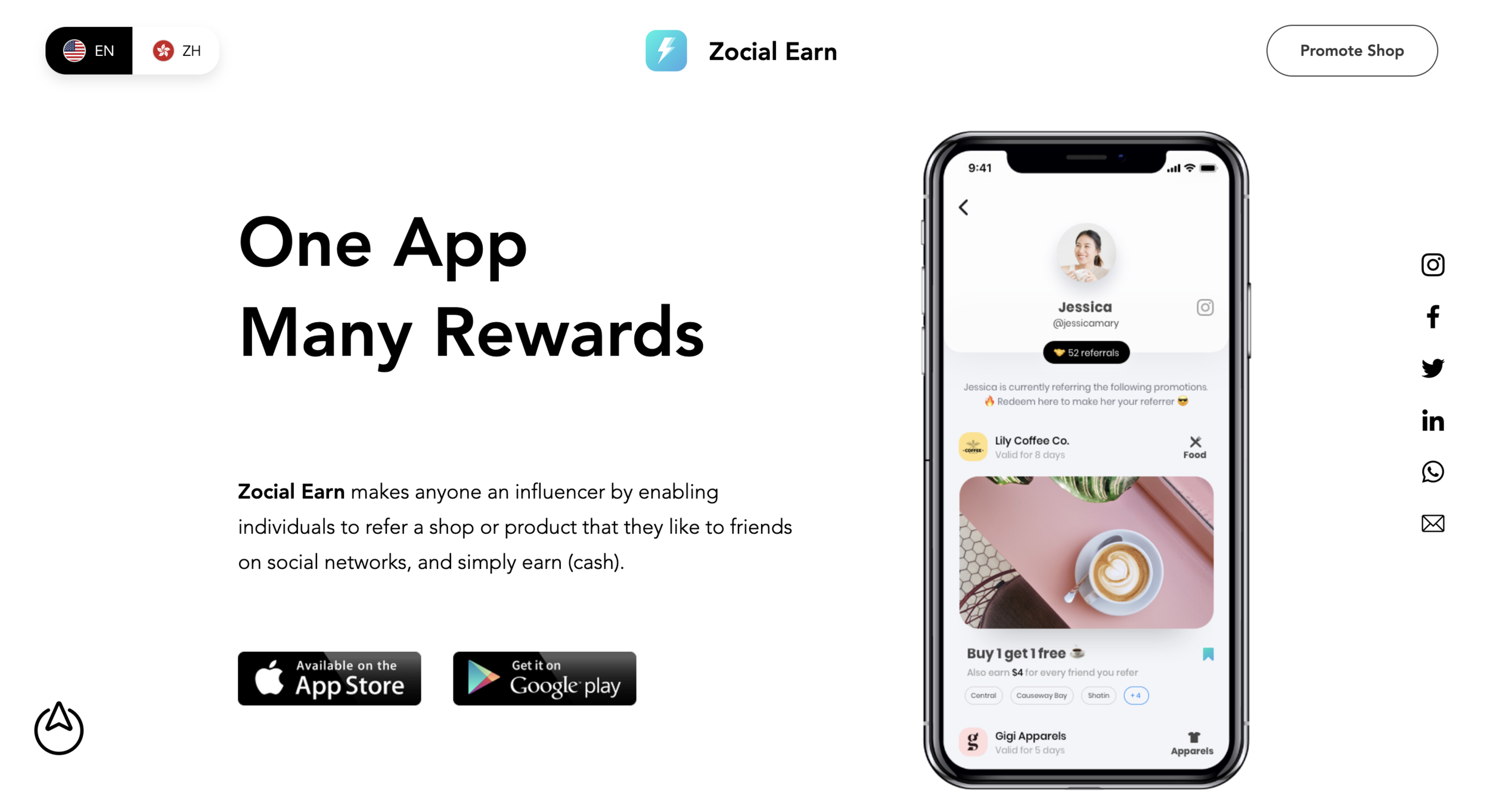
⤷ Zocial Earn | A referrals-based platform for merchants and social network users.
9. Last question: how can people get in touch with you? And if they do, what should they reach out to you for?
They can always reach out to me via Instagram. I have my email in the bio, so they can use that as well. I always respond to every single person who reaches out to me within a day or two.
Ask me for advice on interaction design or on UX. Anyone who wants to get advice on basics, what paths to take, how to get started, how self-learning works, or advice on freelancing, I’ll be happy to help you out!
